
Why Professional Colour Grading Matters in Brand Video
Last updated: March 18, 2026

A lot of business videos feel weaker than they should, even when nothing seems obviously wrong.
The message may be clear enough. The edit may be tidy. The footage may be sharp. But something still feels slightly off. Skin tones shift between shots. One room looks warm, another looks dull or green. A product appears different depending on the angle. The finished video never looks completely broken, yet it still feels less polished, less credible, or less intentional than the brand probably wanted.
That’s often where colour grading matters.
In business video distribution and creative strategy, colour grading is not the whole story. It sits alongside other creative and production choices that shape how trustworthy, coherent, and well judged a video feels. This article goes narrower. It focuses on why grading deserves more attention when marketing teams are commissioning video or reviewing work done internally.
For many teams, this is not something they actively get wrong. It is something they often are not encouraged to think about early enough. Colour grading can sound like a luxury attached to high-end productions, when in practice it is one of the quieter decisions that helps a brand video feel consistent and credible.
You do not need to become an expert in colour to make better decisions around it. But you do need enough awareness to ask better questions and notice when too much is being left to chance.
Why colour grading gets overlooked
Colour grading is easy to underestimate because it usually enters the conversation late.
Most project discussions focus on audience, message, logistics, locations, approvals, and delivery formats. By comparison, grading can sound like a finishing touch. Something cosmetic. Something that can be sorted out in the edit.
That framing misses the point.
Colour affects whether a video feels coherent from shot to shot, whether people look believable on camera, whether a space feels warm or clinical, and whether the final piece lands as intentional rather than assembled. A video can be technically usable and still not feel right.
Colour correction and colour grading are different decisions
One reason this topic stays fuzzy is that people often use colour correction and colour grading as if they mean the same thing.
They do different jobs.

Professional colour grading shapes tone, consistency, and mood, but it depends on strong footage and clear visual intent from the start.
| Process | Main job | What it deals with | Why it matters |
|---|---|---|---|
| Colour correction | Technical balancing | Exposure, white balance, mismatched cameras, unwanted colour casts | It stops footage feeling uneven or distracting |
| Colour grading | Intentional visual treatment | Contrast, palette, saturation, mood, tonal consistency | It helps the video feel aligned with the brand and the message |
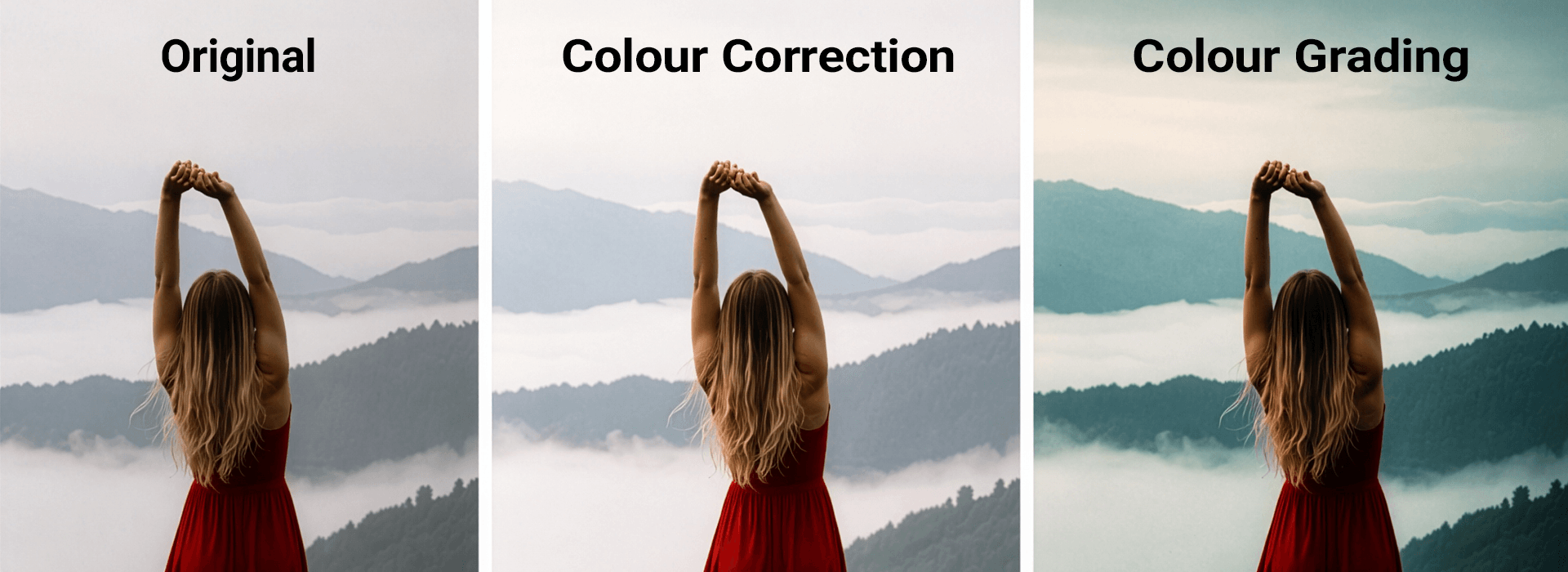
Original footage, colour correction, and final colour grading shown side by side to illustrate how technical balancing and visual treatment shape the finished look.
Correction gets footage to a clean starting point. Grading shapes how that footage should feel. For marketing teams, that distinction matters because a video can be properly exposed and still not communicate the right tone.
Why this matters to marketing teams commissioning video
You are not expected to become a colour specialist. But if you are hiring a production team or reviewing video work, it helps to understand what grading changes.
First, credibility is often visual before it is verbal. Viewers rarely say the colour grading is poor. They simply read the video as less polished, less stable, or less trustworthy than intended.
Second, consistency affects how professional the brand feels. Business video is often built from imperfect real-world material: different rooms, different times of day, different practical lights, sometimes different cameras. Without careful correction and grading, those differences remain visible in a way that can make a piece feel stitched together rather than unified.
Third, the wrong look can make proof feel over-produced. A strong grade should support the message, not overpower it. If the treatment becomes too glossy, too dramatic, or too processed, the content can start to feel managed rather than believable. That is especially risky in interviews, case studies, and testimonial-led work where trust matters more than style.
Colour grading starts before post-production
One of the most useful shifts a marketing team can make is understanding that grading does not begin only in the edit suite.
It starts earlier, with what is captured on the day.
A grade can improve a lot, but it cannot solve everything. If a face is poorly lit, highlights are blown, or a room is difficult to expose evenly, post-production becomes more corrective than creative.
The same applies to resolution. Extra detail can help in some workflows, but it does not replace good lighting, controlled exposure, or a sensible visual approach. That is why the real value of 4K for business video needs judging in context.
Mixed lighting is one of the most common problems. A venue may look good in person but still create issues on camera if it combines daylight, warm bulbs, overhead office lighting, coloured ambient light, and reflective surfaces. Those conditions can push skin tones and neutral areas in different directions, making it harder to achieve a clean and consistent result later.
Venue choice matters too. Marketing teams often choose spaces based on convenience, access, or whether they feel on brand. All of that matters. But it also helps to ask how the location is likely to photograph. Is it bright and neutral? Dark and atmospheric? Hard to control? Likely to flatter people on camera, or likely to create clean-up work later?
That is not a technical side issue. It is part of protecting the final result.
What to look for when reviewing video work
You do not need specialist vocabulary to review visual quality more intelligently.
| What to notice | Why it matters |
|---|---|
| Do skin tones look believable across different shots? | People are often the fastest credibility test in business video. |
| Do interviews feel visually stable and well controlled? | Talking-head content exposes inconsistency quickly. |
| Do different locations still feel like part of the same piece? | Matching and continuity affect how finished the work feels. |
| Do products, interiors, and brand colours look trustworthy? | Unstable colour can weaken confidence in what is being shown. |
| Does the treatment support the message without shouting? | Strong grading should guide perception, not distract from it. |
This kind of review is more useful than asking whether something looks cinematic. That word often encourages vague aspiration instead of better judgement.
How to ask better questions without becoming technical
Marketing teams do not need to tell a production company how to grade. They simply need to raise the topic early enough that it becomes part of the planning conversation.
Helpful questions include:
How are you thinking about the final visual tone of this piece?
Are there any lighting or location concerns that could affect the final look?
Will mixed lighting be an issue in this venue?
How will you keep interviews and b-roll feeling consistent if they are shot in different conditions?
If we want the piece to feel warmer, calmer, more premium, or more emotive, how would that affect production and post?
Those questions signal that the final image matters. They also invite the production team to explain how lighting, exposure, and grading are being handled together.
A simple way to build stronger visual judgement
The easiest next step is not technical. It is observational.
Start paying attention to how things are lit and how that changes what a piece feels like. When you watch strong branded content or streaming work, notice the relationship between room choice, lighting, skin tone, contrast, and mood. Notice the difference between a bright, safe, reassuring look and a darker, more emotive one. Notice when the finish feels polished but still believable, and when it starts to feel too designed for the material.
Once you become aware of that difference, you can bring a much clearer brief into the next production conversation.
That is the real value of understanding colour grading in brand video. Not that a marketing team becomes technical, but that they stop treating the final look as something they simply take as it comes.