
When Nostalgia Helps Brand Video
Last updated: March 24, 2026
The quickest way to spot a weak nostalgia treatment is simple: switch the effect off and ask whether anything important disappears.
If the answer is no, it was probably decoration.
That’s where retro-led brand video often goes wrong. The grain is there. The framing is there. The type has a bit of Y2K attitude. But none of that changes the fact that the message is still broad, the footage is still generic, and the piece still feels like a brand trying on a mood rather than making a clear decision.
So this is not really about whether retro is back.
It is about when nostalgia earns its place in brand video, when it gets in the way, and how to judge that before production or sign-off.
Inside modern video that connects, the broader issue is how business video avoids feeling over-managed. This page is narrower. It is about one creative choice only: when older visual cues help a video feel more grounded, more distinctive, or more legible, and when they simply make it feel borrowed. All of this sits inside business video distribution and creative strategy.
Not every brand video needs a nostalgic treatment
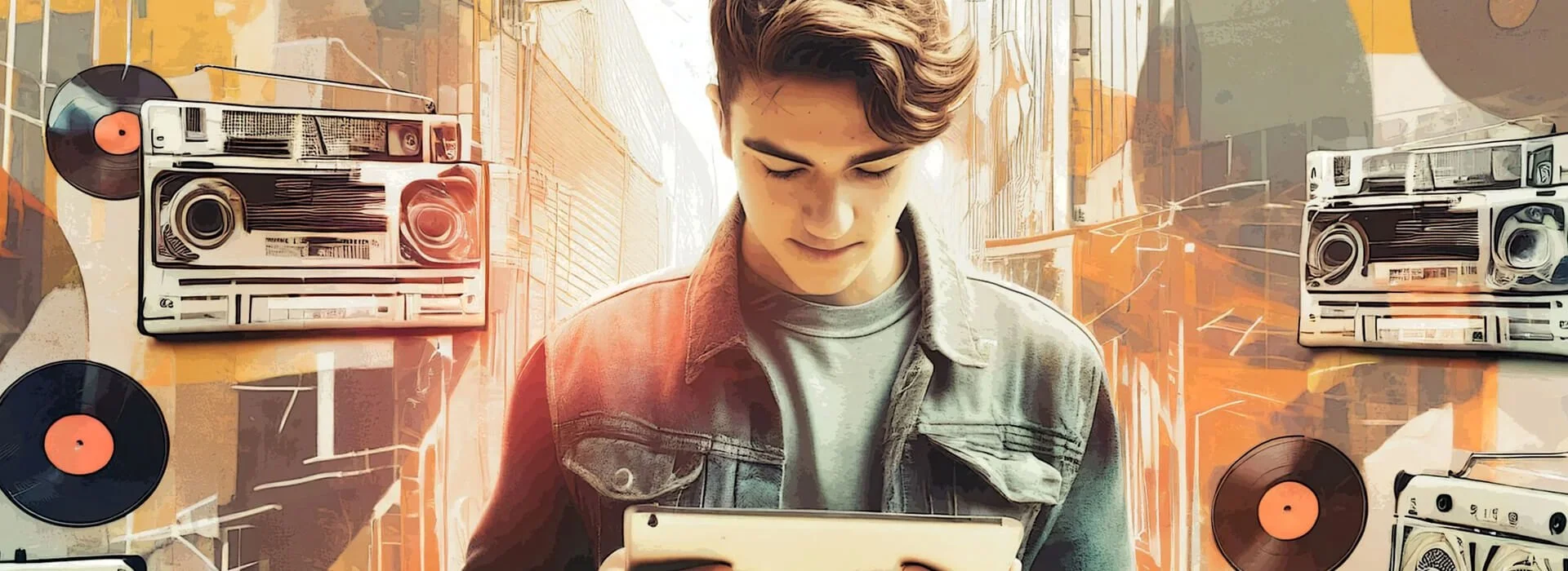
Retro is a visual language, not a strategy.
It can shape mood, texture, rhythm, and recognition. It can’t decide what the video is for, what the viewer should take from it, or what proof makes the message worth listening to.
That is why nostalgic styling often disappoints. It gets added early because it seems to solve several problems at once. It feels less sterile, less corporate, more current. Sometimes that helps. Often it just hides the fact that the underlying idea is still underdeveloped.
Where nostalgia styling actually helps
Retro cues work best when they reinforce something already present in the footage, subject, or setting.
| If the situation is… | What nostalgia is helping with | Why it can work well |
|---|---|---|
| the subject already has natural texture, memory, or material detail | gives physical details more presence and tactility | makes the footage feel authentically handled and grounded rather than airbrushed or detached from the real world it depicts |
| the campaign has a clear cultural reference point | supports and reinforces the core concept | when the reference does real communicative work, the treatment feels intentional and integrated rather than purely ornamental |
| a fully polished version would feel too anonymous or generic | adds shape, warmth, and distinctive character | prevents competent but forgettable work from feeling overly clean, flat, or interchangeable |
The important point is that nostalgia works best when it is reinforcing something real, not trying to invent meaning after the fact.
Where it starts to hurt
The problem is not nostalgia itself.
The problem is using it as shorthand for relevance.
When nostalgic cues become too dominant, the treatment can start competing with the subject rather than supporting the message.
| If this starts happening… | What it usually means | Why it weakens the video |
|---|---|---|
| the styling arrives before the point does | the treatment is carrying too much of the job | if the message is still broad or thin, nostalgia just adds another layer between the viewer and the point |
| the video borrows a visual code it has not earned | the styling feels imported rather than rooted in the concept | it can make the work feel performative rather than deliberate |
| readability gets worse | the treatment is competing with the message | decorative type, heavy overlays, or reduced contrast can make captions, proof, and detail harder to read |
| the visual tone does not fit the decision stage | the same look is being used across very different assets | a treatment that helps a teaser may work against a decision-stage or sales-support asset where clarity matters more |
A better question than “should this feel retro?”
Ask this instead:
What exactly is the nostalgic cue doing for the viewer?
If the answer is vague, the treatment probably is too.
A useful cue might:
make the visual world feel less generic
give the footage more material presence
support a concept with a clear reference point
create faster visual recognition in-feed
soften an overly airless finish
A weak cue usually:
disguises a thin idea
imitates internet shorthand without purpose
muddies readability
overwhelms the subject
dates the work more quickly than expected
What to borrow without copying retro literally
The strongest nostalgic influence often comes from selective choices rather than a heavy-handed effect stack.
Selective nostalgic influence usually works best when it adds warmth and texture without distracting from the message.
| If the stronger move is… | What that usually looks like | Why it usually works better |
|---|---|---|
| adding texture carefully | a restrained grade, slight visual softness, or subtle analogue influence | it gives the video more character without overwhelming the message or making the treatment too obvious |
| using real locations with character | shooting in environments with physical detail, atmosphere, and visual memory | it builds texture into the footage itself rather than trying to manufacture it afterwards in post |
| letting physical detail do some visual work | showing surfaces, objects, packaging, machinery, paper, hands, or process details | it makes the frame feel more grounded and materially real without relying on borrowed retro signals |
| borrowing rhythm or restraint | a calmer edit, more breathing room, or a less airless finish | it can carry some nostalgic influence while keeping the work clear, usable, and less self-conscious |
| keeping type and overlays readable | clear captions, controlled graphics, and selective period influence rather than decorative overload | it protects clarity and keeps the visual treatment in service of the communication rather than competing with it |
| using one or two cues decisively | choosing a specific framing, texture, or graphic reference instead of stacking multiple signals together | it gives the piece a clearer visual point of view and reduces the risk of the treatment feeling forced or cluttered |
In practice, that might mean using a real environment instead of a generic backdrop, showing more physical detail, or choosing a slightly less sterile grade rather than an obvious “retro look”.
Those choices usually age better because they still do the core job of the video.
How the judgement changes by use case
The right answer changes with the asset.
Social teaser
A stronger case for nostalgic styling.
The viewer is moving quickly. Recognition matters. Visual mood does more of the work. A distinctive cue can help the piece feel less interchangeable in-feed.
Homepage brand film
A selective case.
Some nostalgic influence may help with atmosphere or art direction, but it should not dominate. The video still needs to communicate the brand clearly and hold up outside a fast-scroll environment.
Sales-support or decision-stage video
A weaker case for anything heavy-handed.
By this point the viewer usually needs clarity, proof, and ease of understanding more than visual flavour. If the treatment makes the piece harder to read or less straightforward, it is probably working against the job.
Questions to settle before production
Before you build a retro-led treatment, settle these questions.
What is the actual job of the video?
What on-screen proof is carrying the message?
Which exact cue is being chosen, and why?
Where will the asset be watched?
Does the speaker and setting still hold up without the treatment?
If the person on camera feels too stiff or the environment feels too generic without the look layered on top, the real issue may be earlier in the production chain. In those cases, better direction or interview handling often matters more than styling, which is why sounding natural and credible on camera remains a separate and more relevant sibling page for that problem.
A simple sign-off test for the first cut
Before approving the edit, ask:
If the effect came off, would the idea still stand up?
What do I notice first, the point or the treatment?
Has the styling helped the footage, or covered for it?
Is anything now harder to read, hear, or understand?
Does this fit the stage of the viewer journey?
Will this still feel considered in six months?
Those are stronger review questions than “does it look current?” because they keep the decision tied to use, not novelty.
The aim is not retro for its own sake
Nostalgic styling can be useful.
It can give a piece texture, shape, warmth, and a stronger sense of visual world.
But that only helps when it is serving a clear idea and footage strong enough to carry it.
Used carelessly, it becomes surface language.
Used well, it becomes art direction.
The goal is not to make a brand look younger than it is or more culturally fluent than it is. The goal is to make the work feel less generic without making it less clear.
In practice, that usually comes from better references, sharper briefs, stronger locations, calmer direction, and more restraint in the edit.
Quite often, the best result is not a retro video.
It is simply a video with more character and less visual deadness.